Product Page Design: 9 Best Practices To Convert Visitors Into Customers
By Weby Ditor | September 22, 2020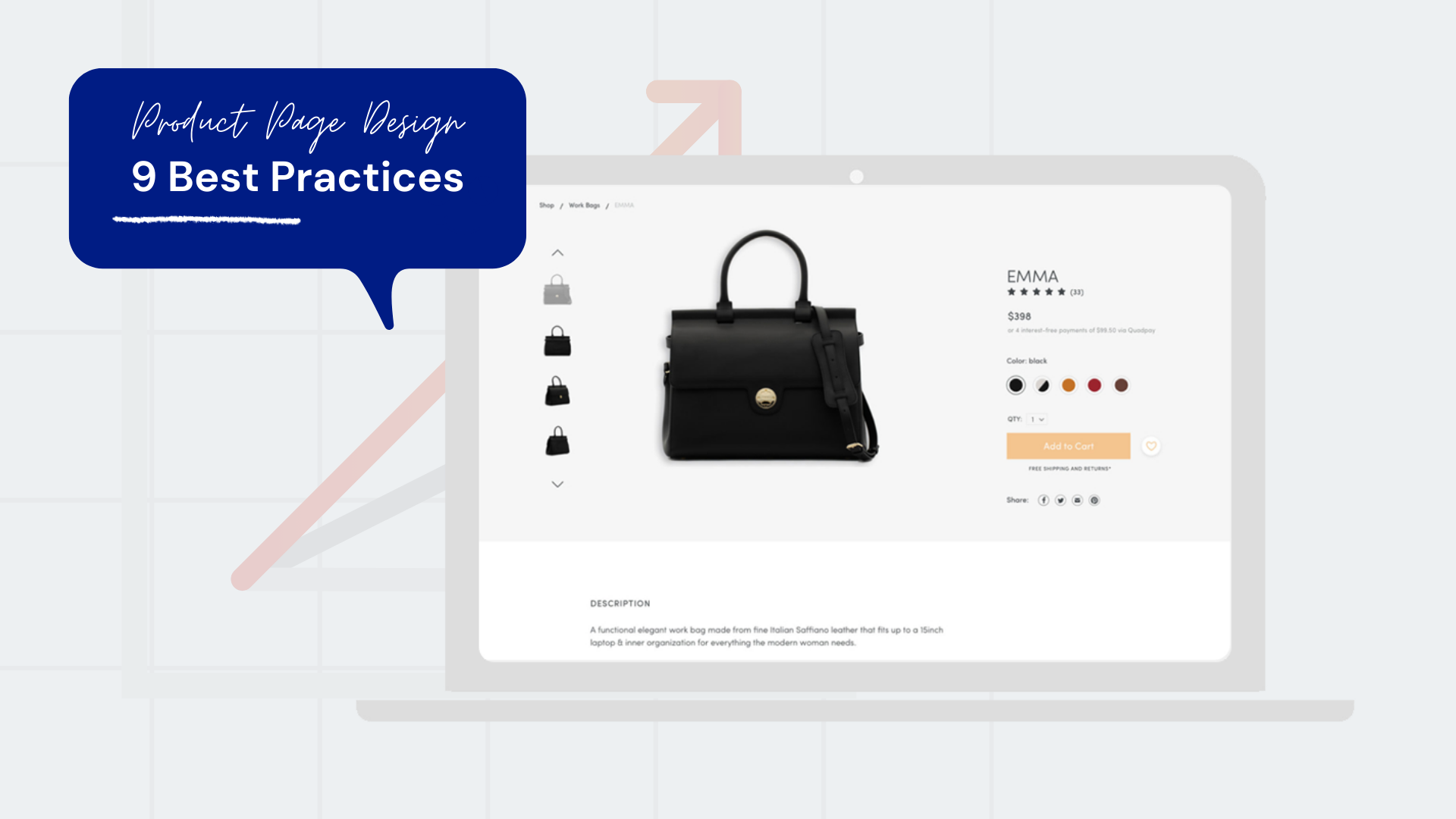
Your product page is the most essential part of your ecommerce store. It can make or break a sale.
Imagine a visitor lands on your ecommerce site, searches for something, then clicks on a product. It's the moment of truth, and to make sure they stick around, you have to have a well-designed ecommerce product page. To make the visitor but your product, you have to think strategically when it comes to product page design. You have to be meticulous at everything-from the images you use and the description you write to the design you present and to the smooth checkout process.
Everything in your product page needs a great deal of attention. Since visitors cannot to touch, feel, or even wear your products before buying, it is the design and content of your product page that decides whether a visitor becomes a buyer or not.
Your product page design must do atleast these three most important elements well:
✔️ It must have quality images, showing the product in different angles.
✔️ It must provide an detailed, benefit-focused description about the product.
✔️ It must offer a simple and obvious way for buyers to take the next action towards purchasing.
To help you get started, here are 9 product page design best practices that can help you in improving your ecommerce product page designs, and ultimately increase conversions.
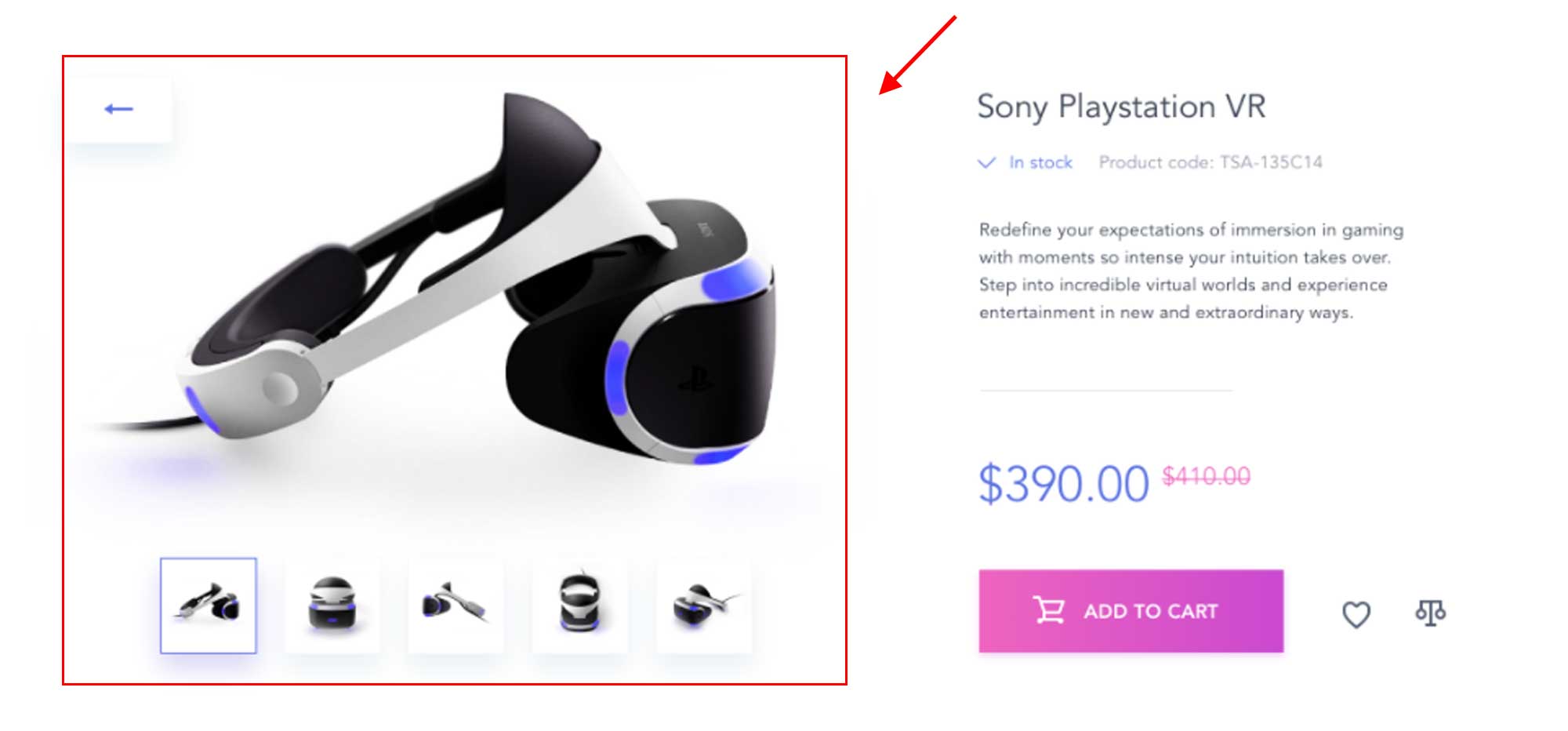
1. Use big and clear images
The shopper can’t see the product in person, thus with a big, clear photo, they can assess its qualities.
You also need to optimize your images so they will not have high load time. Bear in mind that not everyone has a fast internet connection.
With high-quality images in your product pages, shoppers will feel confident and motivated in completing their purchase.
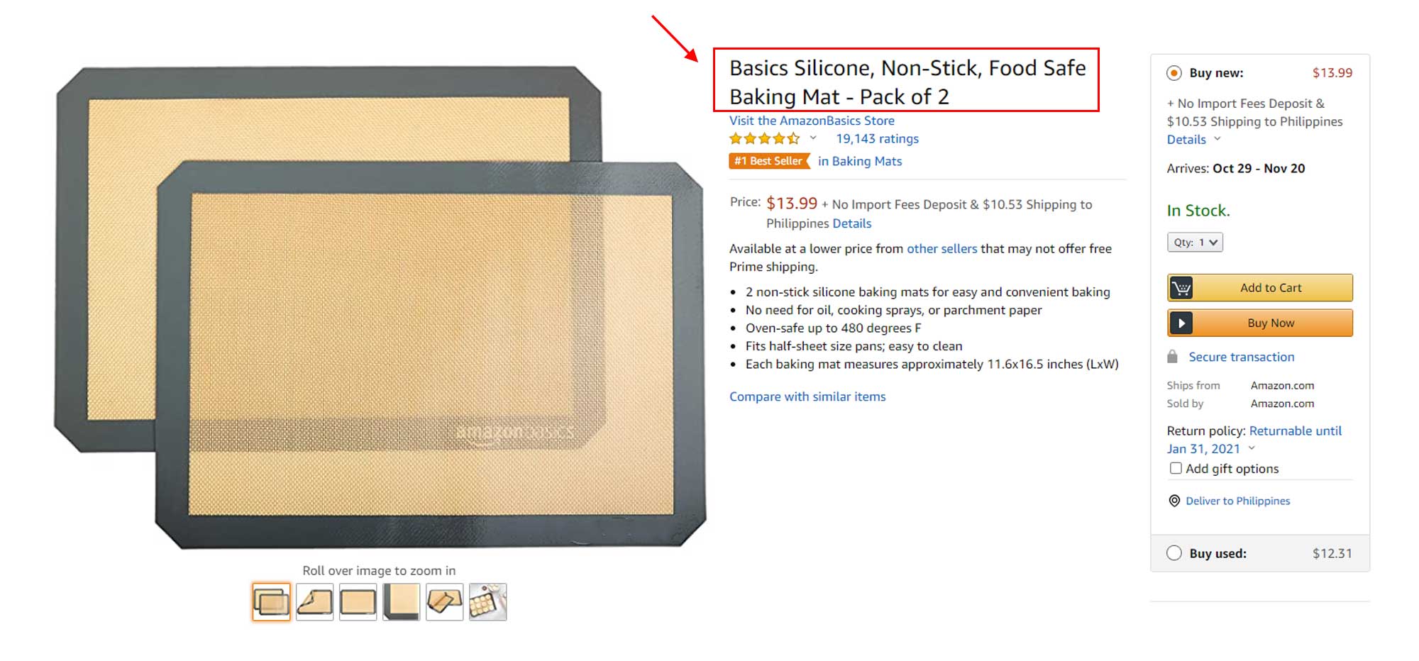
2. Descriptive product name
The more descriptive, the better when it comes to product naming conventions. That’s because each word is a possible organic search keyword. Google prefers product pages with descriptive names because it makes it easier for consumers to find exactly what they are searching for.
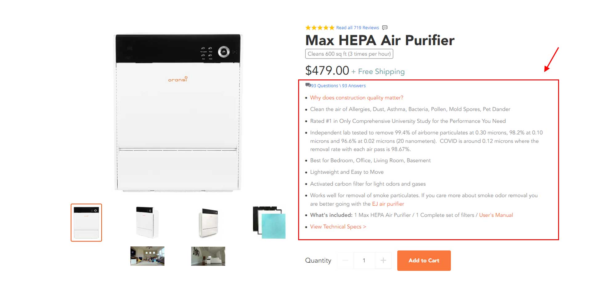
3. Detailed, benefit-focused description about the product
Focus on the advantages instead of the features as you explain your product. Benefits are what sell.
No matter how shallow it may be, individuals just want to solve their problems. Keep product descriptions short, easy to understand, and answers the following:
- Who is the product for?
- What is the product used for?
- How can this product help them?
- What benefits can customers get?
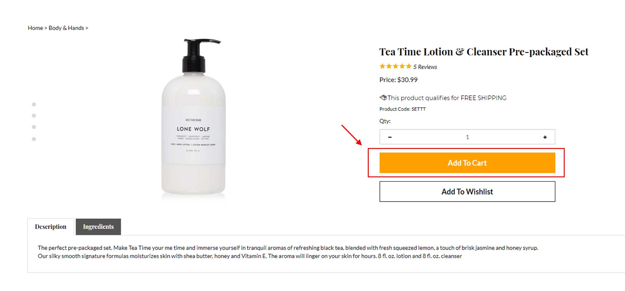
4. Visible and easy to find Call-to-Action
This call-to-action usually pertains to the ‘Add to Cart’ or ‘Buy Now’ button. It has to be easily seen and should compel the visitor to act.
When deciding on the color of your CTA button, keep in mind three things
Make the color stand out. Select a color that is bright enough to grab the attention of the audience.
Keep it large . Make it the largest button on your product page.
Follow color theme . Your CTA button should go well with your ecommerce site’s color theme.
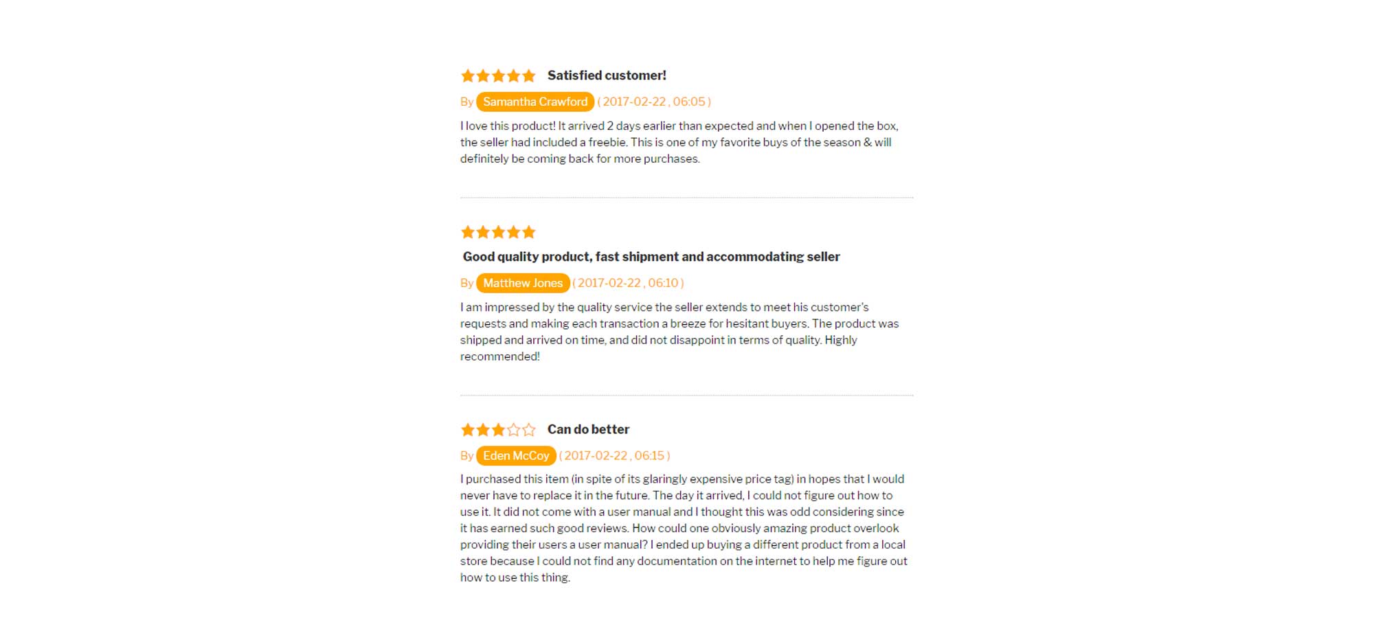
5. Include social proof
Forms of social proof include celebrity recommendations, user reviews, testimonials, and social media buzz. Your clients want to know they’re making the right decision. Almost every online store has some kind of social proof. Why? Because it helps give a higher assurance level.
It also helps you build trust, and credibility among existing customers.
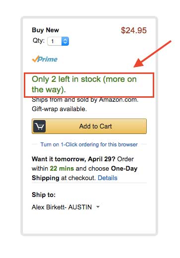
6. Use urgency and scarcity
Communicating urgency and scarcity encourages individuals to convert more often and more quickly.
Aim to express urgency by providing discounts on short amounts of time, informing the users when the deadline is, ofcourse. One way to demonstrate how much time is left before the product price goes up again is through countdown timer.
Scarcity can be communicated by telling consumers how many goods are left in stock. This give people a more favorable attitude toward a product.
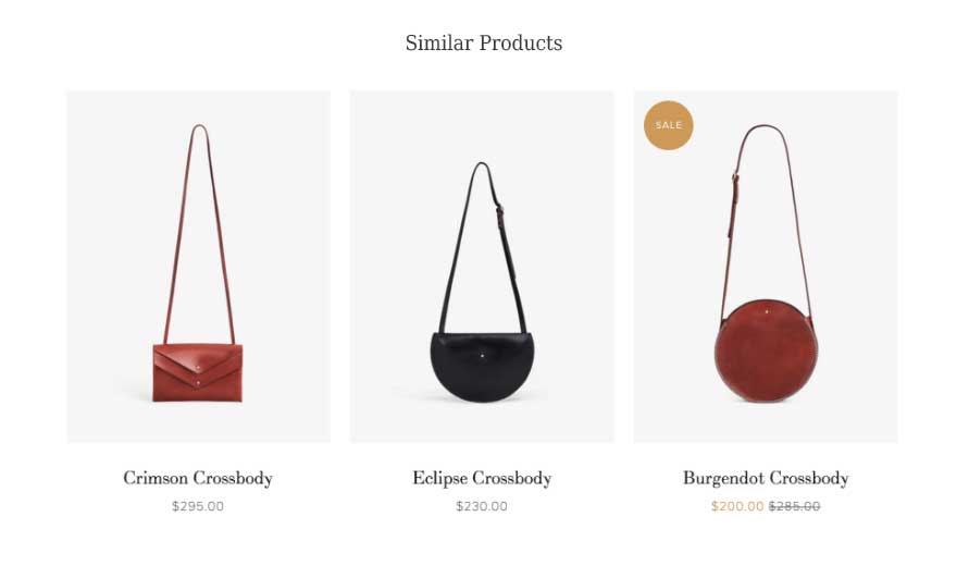
7. Display related products
It may be that the product being viewed is out of stock, or they want the same product of different style.
To handle this, display related products that is based on what the customer viewed or products based on similar features. By providing related products and giving the visitor the alternatives to compare product features/benefits, you can often maintain the attention of a prospect who may otherwise have gone elsewhere.
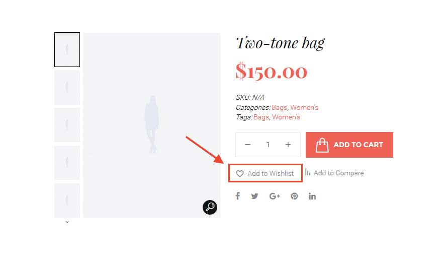
8. Add to wishlist
The customer may not be ready to purchase currently. So a great function to have in your ecommerce products page is the ‘Add to Wishlist’ button. This makes it so that users have the ability to add the product to a wishlist and save it for later consideration.
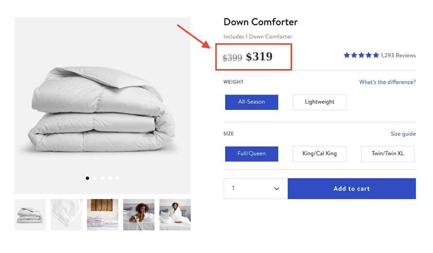
9. Be concise of the price
Most of the time, the price is the deciding factor whether or not the customer will but the product. Make your price concise and visible on the product page.
Run promotions and offer discounts. Hightlight sales by displaying how much customer save on a product, and emphasize the limited supply that’s being sold at the reduced price.
Conclusion
An optimized and structured page design can often overcome the uncertainty that visitors feel towards less-known brands.
Using the above mentioned practices to build an effective customer experience on your product page can give you a competitive edge in the online retail environment. If you’re product page attract customers, you can convert more visitors into customers and increase your sales revenue.
If you're an online retailer wanting to optimize your site with the outlined tips above but don’t know where to start, worry no more! Go4global Design can help you with your ecommerce needs. Contact us now!